Posts

Illustrating Sustainable Energy Systems

  • Residential Energy System

    Sustainable Energy System for Residential Application
  • Industrial/Manufacturing Facility

    Industrial/Manufacturing Property Energy System
  • Large Commercial Property

    Large-scale Sustainable Energy System

How does a sustainable energy system work anyway?

As we make the transition to sustainable energy, illustrating sustainable energy systems can help to inform the public about how they work. Anyone in a developed country uses energy on a daily basis, even if it is only to flip a light switch. But most of us have only a limited understanding of how that energy gets to our home or place of work. Many of us know even less about what makes energy “sustainable” or not.

More directly, energy companies need to provide information to city managers and/or property owners with which they can make decisions about energy projects.

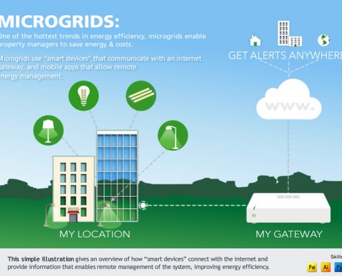
Recently a client in the renewable energy industry asked us to help them tell their story with illustrations that would show the various components of a self-sustaining energy system and how they work together.

Our Process:

  • First, we interviewed the client and gathered information about the various parts of a sustainable energy system.
  • Rough sketches of the systems were created to make sure we had the details correctly represented.
  • We then developed illustrations that show how a self-sustaining energy system works for different types of properties, from a residential scale to an industrial scale.

For the client, these illustrations will serve as an overview for more detailed information about project development and the energy system products they sell.

Infographics & Analytics

Analytics  seem to be in use for every area of life these days. Chances are your business is making use of data analysis everyday, but how do you communicate to your customers what matters about the data?

Maybe we’re biased, but we’ve observed that images, especially infographics that relate to your company’s business, is one way to explain “what it all means” once you have the data.

We recently had the chance to develop an infographic for Veros — a real estate analytics firm. The big story was that the top markets were all west of the Mississippi and the bottom markets seemed to be east. The client wanted quite a bit of data about specific markets, so our challenge was to organize that in a manner that still allowed a viewer to get the big picture at a glance.

Tips for creating infographics:

  • Pie charts are best to compare percentages to the whole, and for categories that are less than 5% of the total, it may be best to group as “Other”.
  • Line charts can effectively show fluctuations over time
  • Yes, you can combine more than one type of chart in an infographic; the rule is to keep thing visually simple so the most important facts can be understood in a glance.

Here’s an example infographic:

2014 Q3 VeroFORECAST Infographic

Got comments or questions? Click the button and get in touch!

Save

Portfolio Items